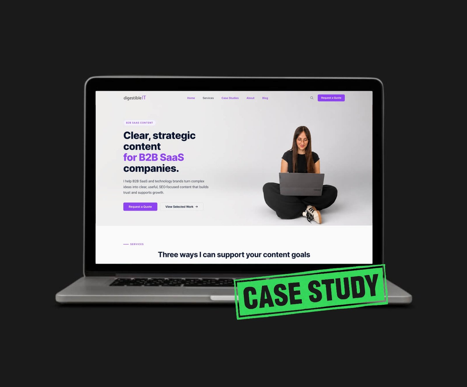
Project Overview
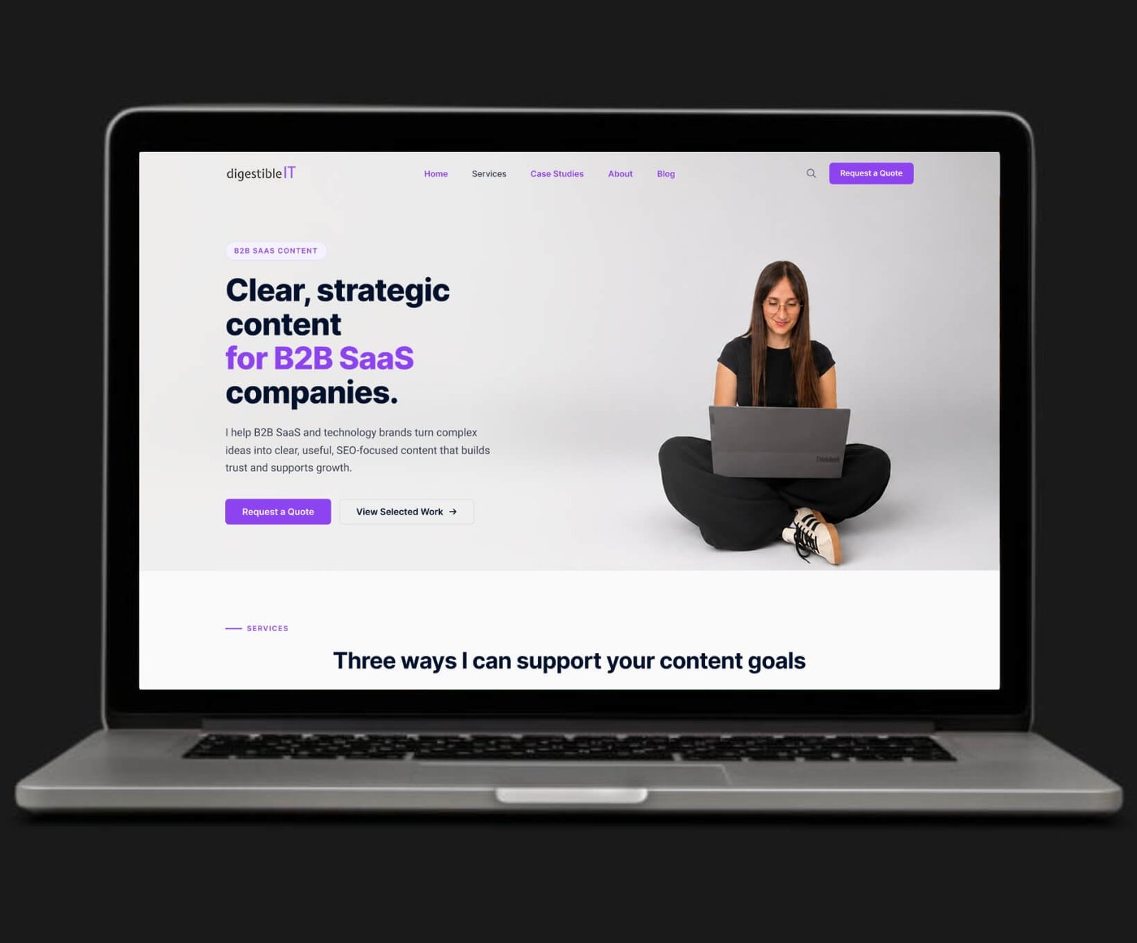
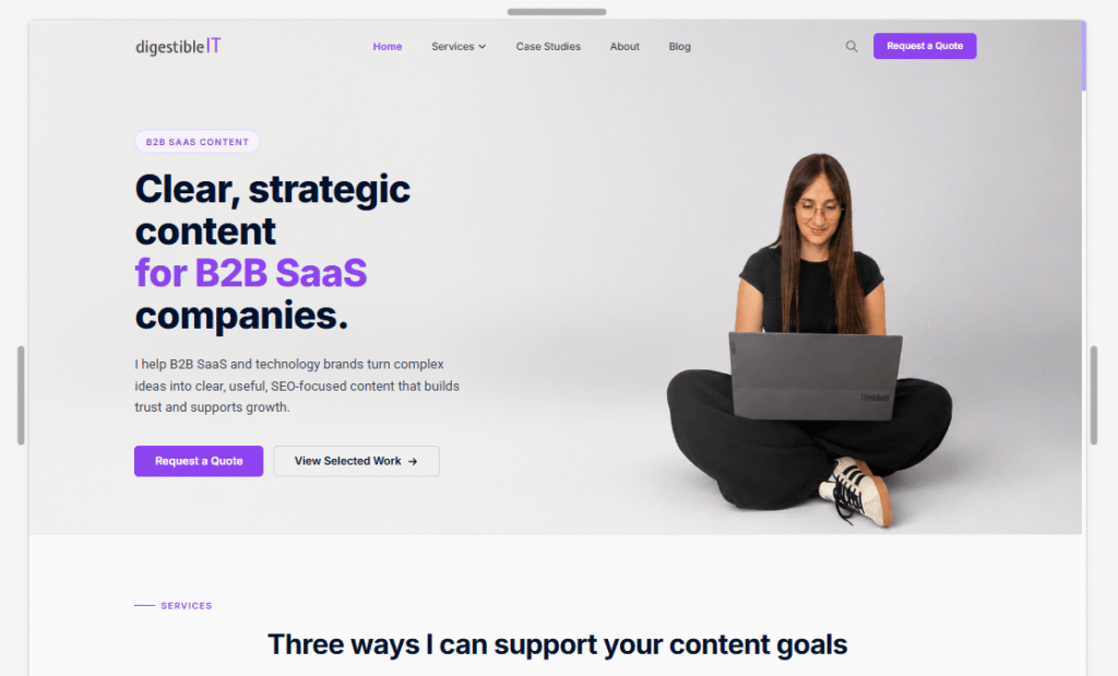
Preview of the redesigned Digestible IT homepage.
Research
The research goals were to understand Digestible IT’s business objectives, identify the information potential B2B SaaS clients need when evaluating a content partner, and uncover the main barriers in the current website experience.
Stakeholder Interview
Existing Website Audit
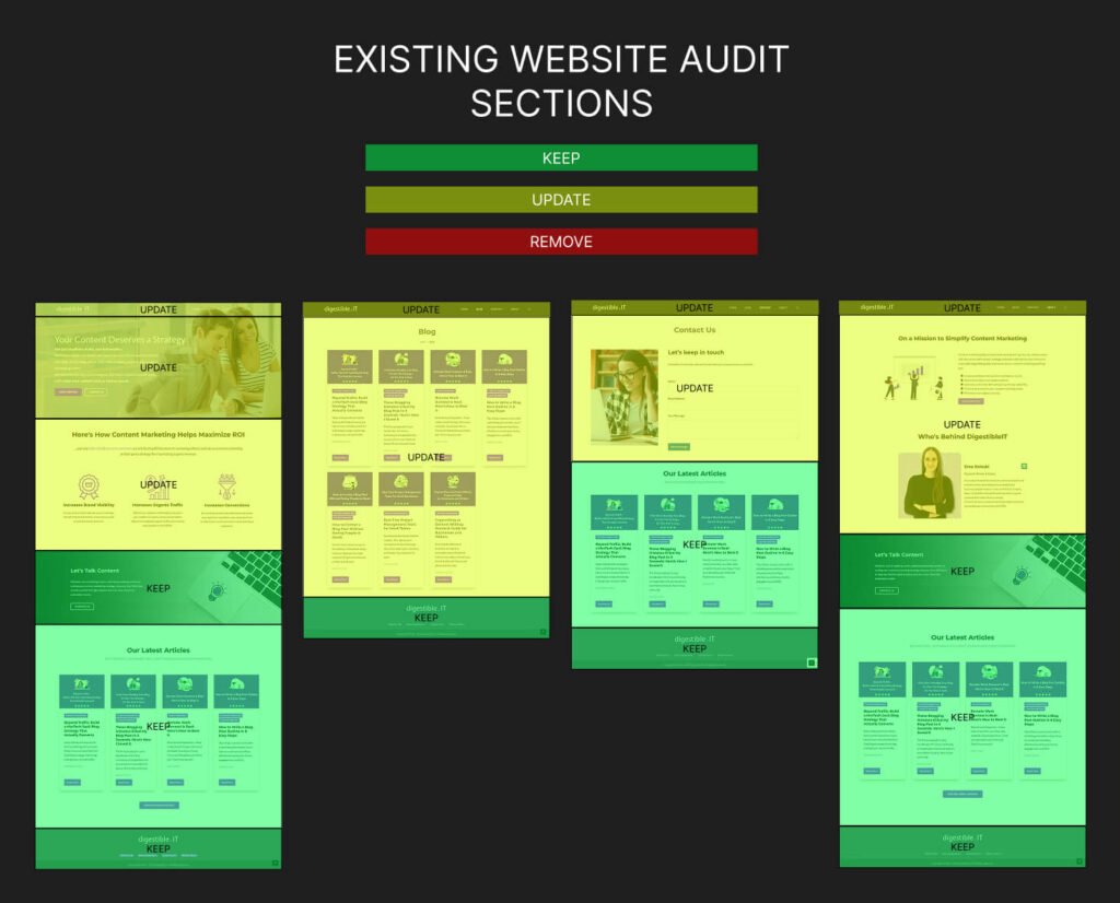
The audit helped define what to retain, remove, and create for the service-focused redesign.
Competitor Analysis
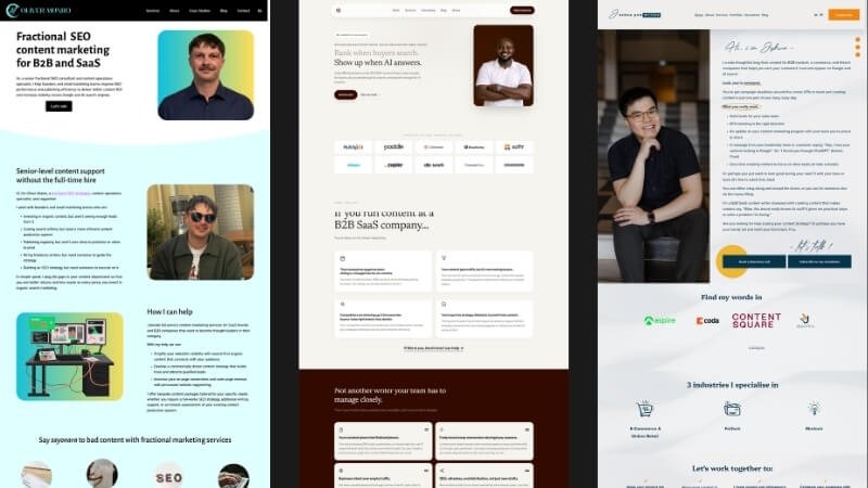
Three independent B2B SaaS content-service websites.
Key Research Insights
The competitive audit showed that effective service websites present their offer early, clearly define their target audience, and connect services to specific client problems. Competitors organize services into clear categories, build credibility through personal introductions, testimonials, client logos, work samples, and results, and use repeated CTAs and process information to guide visitors toward contact. Their blogs support the service offer rather than dominate the homepage. Digestible IT should adopt these patterns while keeping the structure concise, easy to scan, and focused on its three core services.
Proto-persona
To translate the initial assumptions into a clearer user context, I created Laura Mitchell as a proto-persona.
Laura represents a marketing or content lead at a B2B SaaS company who is responsible for maintaining a consistent content strategy despite limited internal capacity. She needs a reliable long-term content partner who can understand the company’s brand voice, create clear and human SEO-focused content, and reduce the workload on her team.
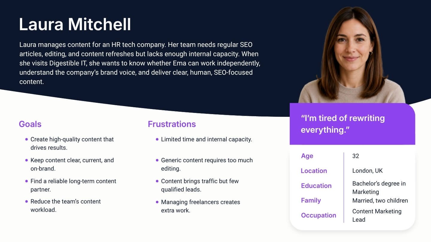
Laura, the target B2B SaaS content lead.
Problem Statement
Laura is a B2B SaaS Marketing/Content Lead who needs a clear and efficient way to understand Ema’s services, evaluate her expertise, and review relevant work because the current blog-focused website does not clearly communicate the service offer, trust signals, collaboration process, or path toward requesting a quote.
Proto-journey
Using Laura’s goals, frustrations, and assumed needs, I mapped her journey from first discovering Digestible IT to understanding the available services, evaluating Ema’s expertise, learning how the collaboration process works, and deciding whether to request a quote. The map highlighted the need for clear service information, visible work samples and trust signals, a transparent process, and a simple inquiry path that supports Laura at each stage of her decision-making.
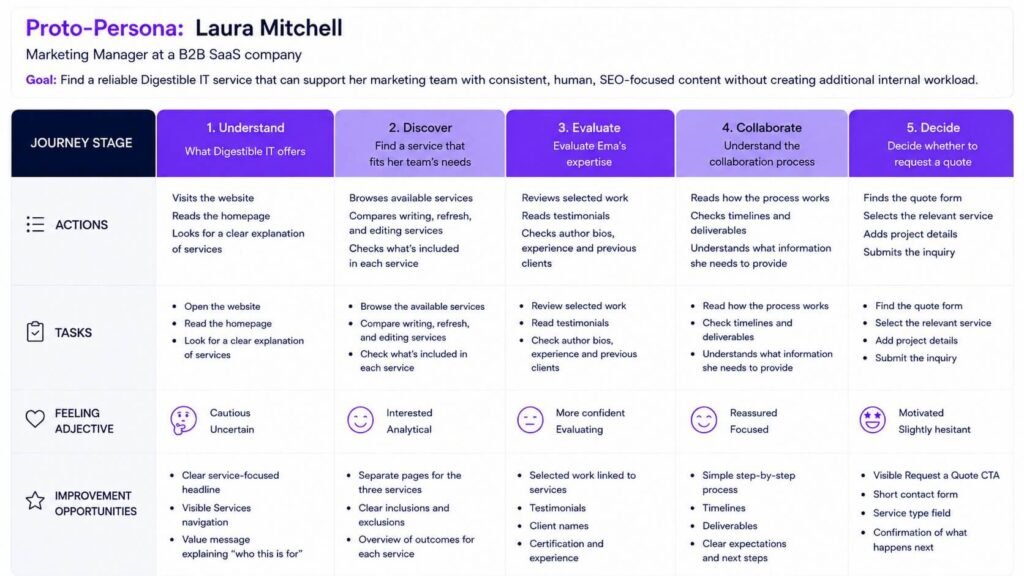
Laura’s path from discovery to inquiry.
Ideating
How Might I & Rapid Sketcing
During the ideation phase, I used How Might We questions, rapid sketching and AI-assisted brainstorming to explore possible solutions. I evaluated, selected, and refined the strongest ideas, focusing on clear service communication, trust, process transparency, and conversion.
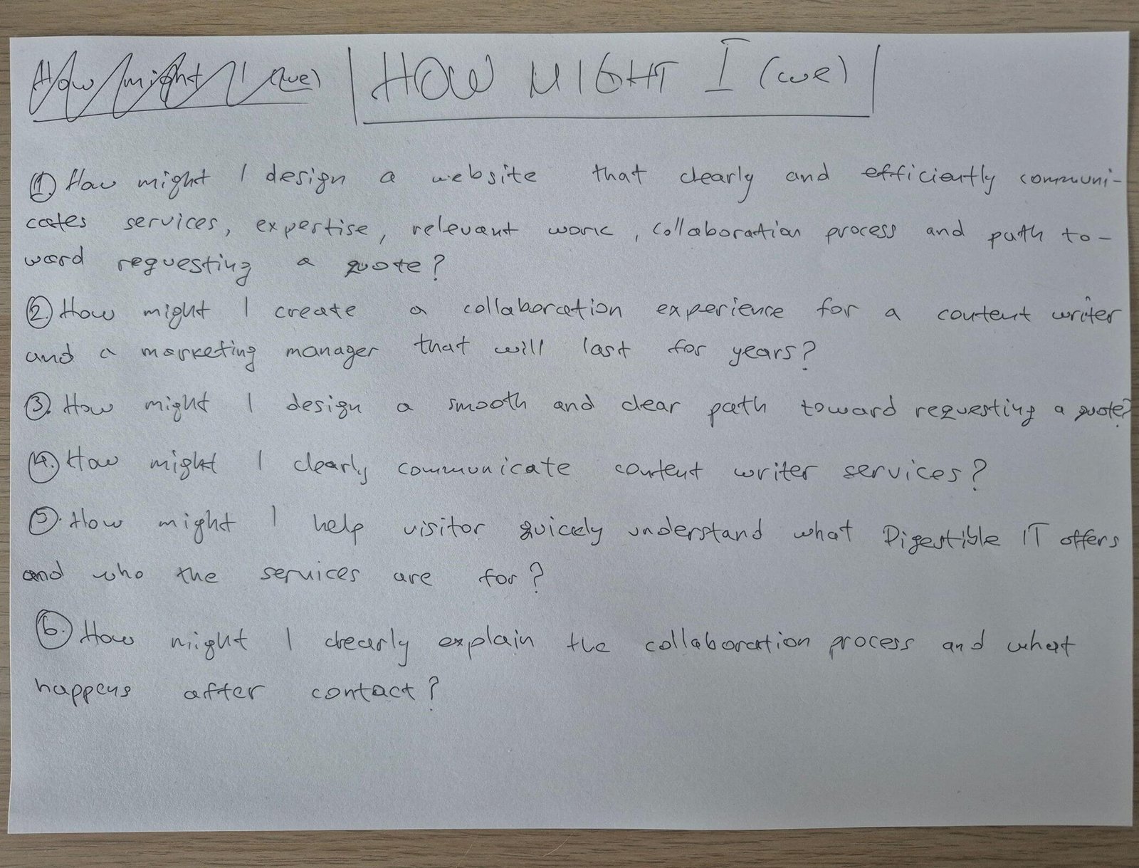
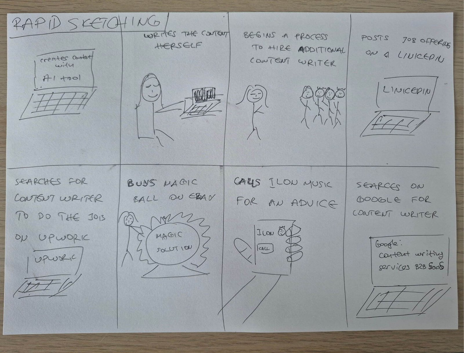
Turning insights into design opportunities.
Restructuring the Experience
The existing information architecture prioritised blog content, while the new business goal required a service-first structure. I reorganized the website around service discovery, trust, and a clear path toward requesting a quote.
Sitemaps
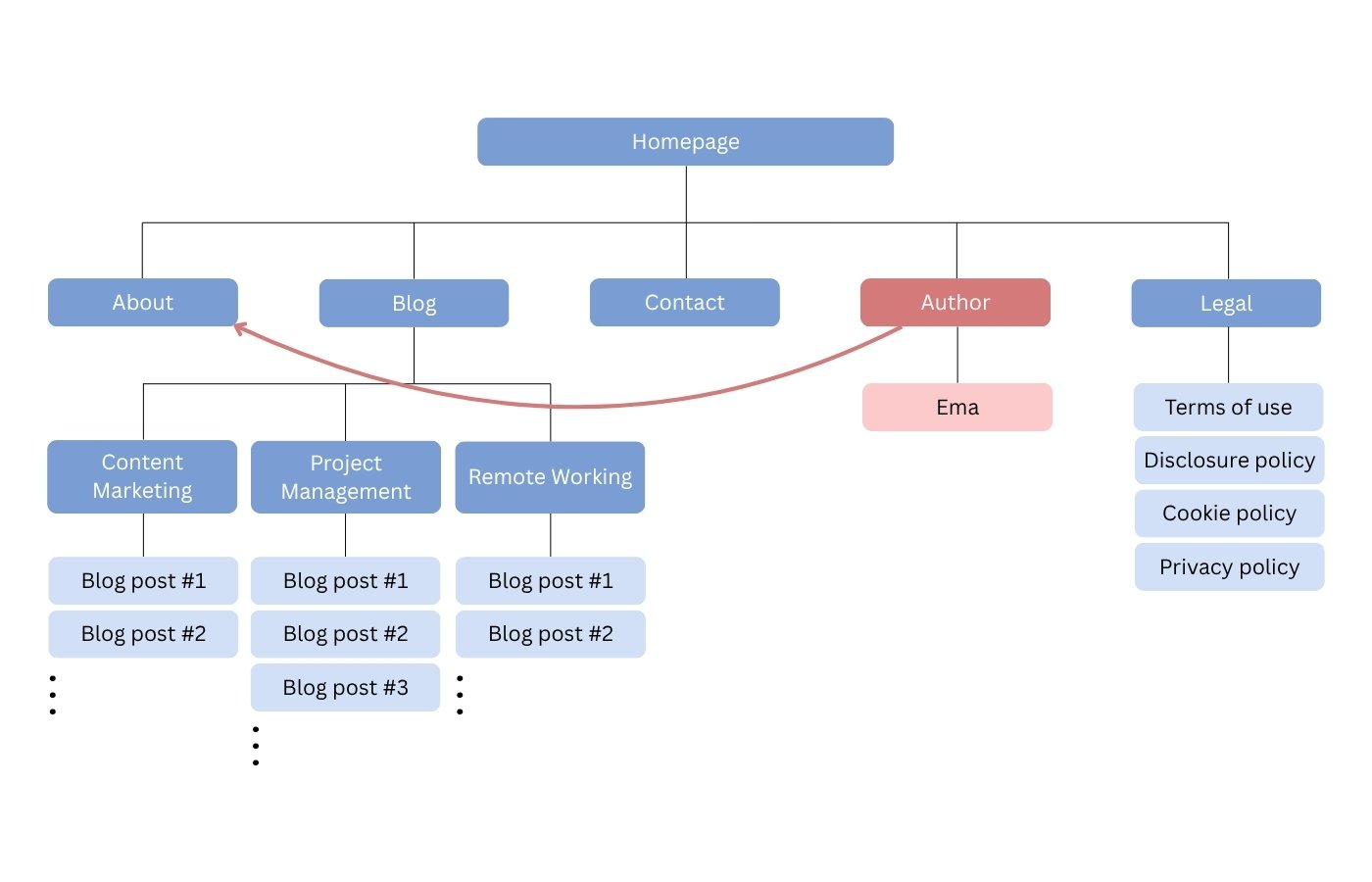
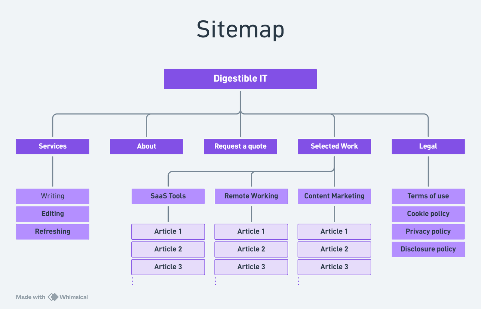
The new sitemap places Services, Selected Work, About, and Request a Quote at the centre of the experience. Blog content remains available, but now supports service discovery rather than dominating the website.
User flow
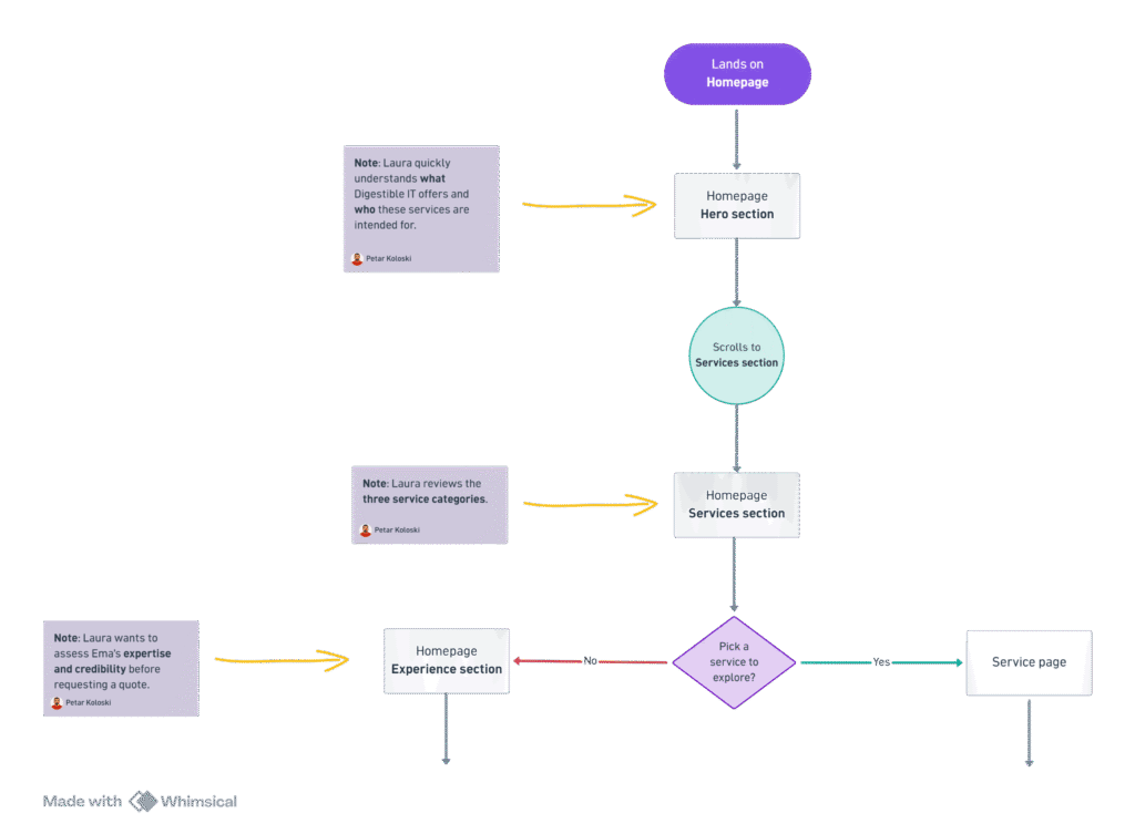
I mapped Laura’s main path from understanding the offer to reviewing a relevant service, evaluating work and trust signals, and submitting a quote request.
Defining the Visual Direction
Logo Redesign
The original logo used a dot between “digestible” and “IT,” which could visually suggest a .it domain even though the website uses .com. I simplified the wordmark by removing the dot and created light and dark versions for use across different backgrounds.

Moodboard and Visual Style
After defining the logo direction, I created a moodboard that combined a clean SaaS aesthetic with a more approachable and human visual tone. The design uses strong hierarchy, generous white space, dark navy for structure, and purple as the main brand accent.
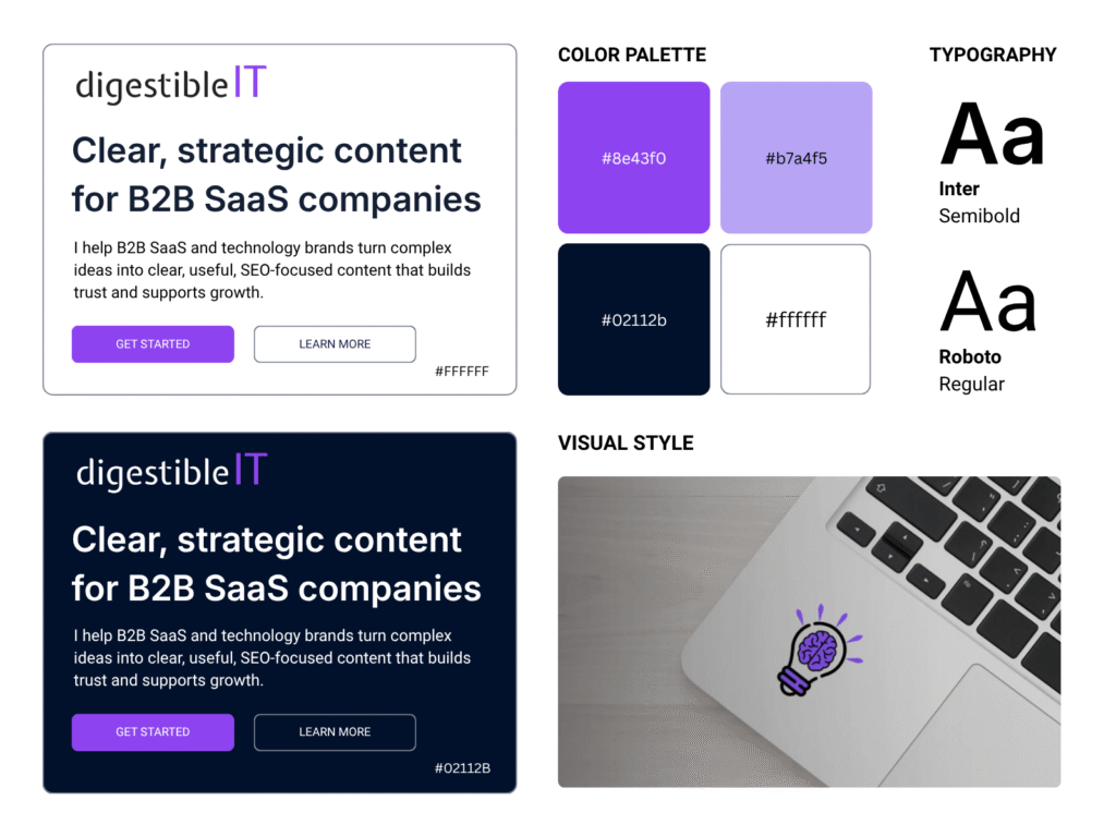
Visual direction for the redesign.
Typography
Inter SemiBold was selected for headings because its strong, modern forms create clear hierarchy and support the B2B SaaS positioning. Roboto Regular was selected for body text because it is neutral, familiar, and easy to read across longer sections.
Colour
I applied a 70–20–10 colour distribution: white as the dominant background, dark navy for structure and readability, and purple for CTAs, links, and key accents. Light lavender supports secondary backgrounds and interface elements.
Designing
Paper Wireframes
I used paper wireframes to explore page hierarchy, section order, CTA placement, and content relationships before moving into visual design. I created alternatives for the homepage and key pages, then refined the strongest ideas into a consistent website structure.
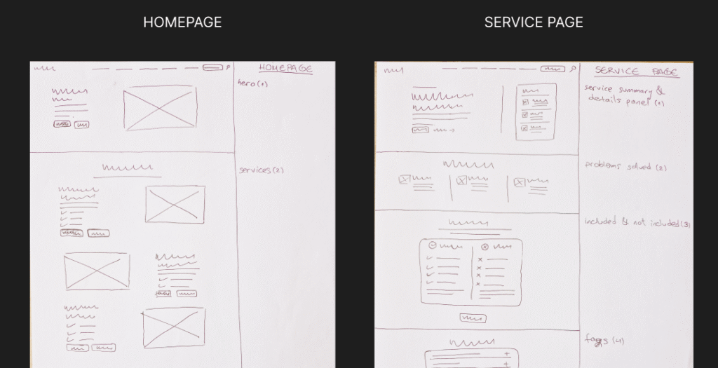
Stakeholder Review
I presented the research, information architecture, and paper wireframes to Ema with a focus on functionality and user flow. Her feedback helped refine the page structure, remove unnecessary content, and clarify which information needed greater emphasis.
From Wireframes to Prototype
With the structure approved, I moved into Figma and created the desktop prototype. I used AI-assisted tools to accelerate layout exploration and repetitive production tasks, while manually reviewing the hierarchy, content, components, and final visual decisions.
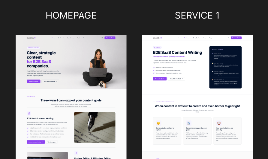
Stakeholder Outcome
I presented the desktop prototype to Ema, who responded positively to the visual direction, clearer service structure, and stronger focus on potential clients. The design phase was successfully completed, and implementation is the next stage of the project.
Accessibility Considerations
Accessibility was considered through readable typography, sufficient contrast, clear interaction states, descriptive labels, and consistent content hierarchy. The form structure was designed to support clear instructions and understandable errors.
Reflection
Accessibility Considerations
This was my first complete UX/UI project after earning the Google UX Design Certificate. It showed me how closely research, information architecture, branding, content, interaction design, and implementation are connected.
I used AI extensively as a support tool for research synthesis, brainstorming, content development, image editing, and rapid prototyping. The main lesson was that speed does not replace design judgement. Every generated result still required review, refinement, and a clear reason for being included.